Have you noticed how a subtle animation can make a button click feel more responsive, or how smooth transitions can guide your attention across a page? These seemingly small motions play a significant role in shaping how users perceive and interact with digital interfaces. Motion design in UI/UX transforms static screens into engaging, intuitive experiences, helping interfaces feel alive, responsive, and human-centered.
In this guide, we explore 15 essential motion design principles, illustrated with real-world examples to show their impact on usability and engagement. From micro-interactions to seamless page transitions, you’ll discover how motion can guide attention, reinforce hierarchy, and create memorable experiences. We’ll also discuss how to prototype and test motion designs using interactive design tools, ensuring animations are not only visually appealing but also functional and user-friendly. By the end of this article, you’ll gain a comprehensive understanding of motion design principles and practical strategies to apply them effectively in your UI/UX projects.
Motion design in UI/UX refers to the strategic use of animation and movement within digital interfaces to enhance usability, communicate hierarchy, and create engaging user experiences. Unlike traditional animation, which is often purely decorative or narrative-driven, motion design in UI/UX serves functional and interactive purposes, guiding users through tasks, providing feedback, and helping them understand system responses.
There are several types of motion commonly used in interfaces:
In practice, motion design enhances both the aesthetic appeal and functional clarity of an interface. It can make interactions feel more natural, reduce cognitive load, and improve the overall perception of speed. For example, a subtle easing animation when expanding a menu can help users track where content moves, while a small bounce effect on a completed action confirms that their input was recognized.
Modern UI/UX motion is also highly data- and context-driven, meaning animations are designed not just for flair but to support user goals, guide attention, and improve efficiency. Well-implemented motion design aligns with the principles of timing, spacing, and consistency, ensuring that movement feels intuitive rather than distracting.
Motion design is more than decoration—it is a strategic tool in UX that shapes perception, guides attention, and enhances engagement. Its value can be summarized in the following key points:
Well-designed motion, such as subtle button feedback, smooth page transitions, or skeleton screens, makes interfaces feel faster and more responsive, even if actual loading times remain the same. This improves user satisfaction, reduces frustration, and builds trust, particularly in content-heavy or interactive applications.
Motion helps users focus on important elements and understand interface hierarchy. Animations can indicate changes in state, highlight key actions, or reveal additional content, reducing cognitive load and ensuring users don’t miss critical information. Examples include fading modals, animated call-to-action buttons, or subtle hover effects.
Thoughtful motion injects personality and delight into interfaces. Micro-interactions, smooth transitions, and responsive animations create a sense of life in the UI, enhancing brand perception and user connection. Users are more likely to remember and enjoy interfaces that feel intuitive and engaging.
By making interactions feel smooth, guiding attention, and providing reassuring feedback, motion design reduces friction in the user journey. Interfaces with well-crafted animations tend to have higher engagement, lower bounce rates, and improved conversion rates, demonstrating that motion is not just aesthetic but functional.
Animations clarify transitions between states, show the results of user actions, and provide feedback without requiring additional text. This helps users understand the interface quickly and act confidently, making complex or data-heavy platforms more approachable.
Here is a table of the 20 motion design principles with examples for you to quickly understand the key features of that:
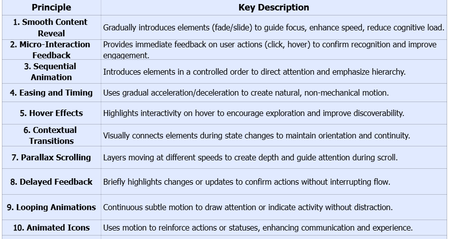
Alt:key features of motion design principles
Alt:key features of motion design principles
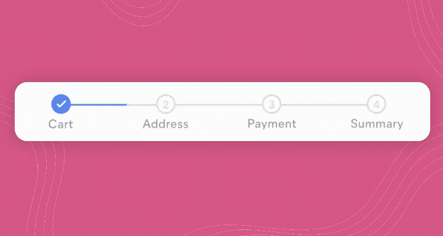
Smooth content reveal is a motion design principle that emphasizes gradually introducing elements as users navigate a page. By animating content such as images, text, or product cards into view with subtle fade-ins or sliding motions, designers can guide user focus, enhance perceived speed, and make the interface feel dynamic without overwhelming the user. This principle also helps reduce cognitive load by controlling the order in which information appears, allowing users to process content naturally.
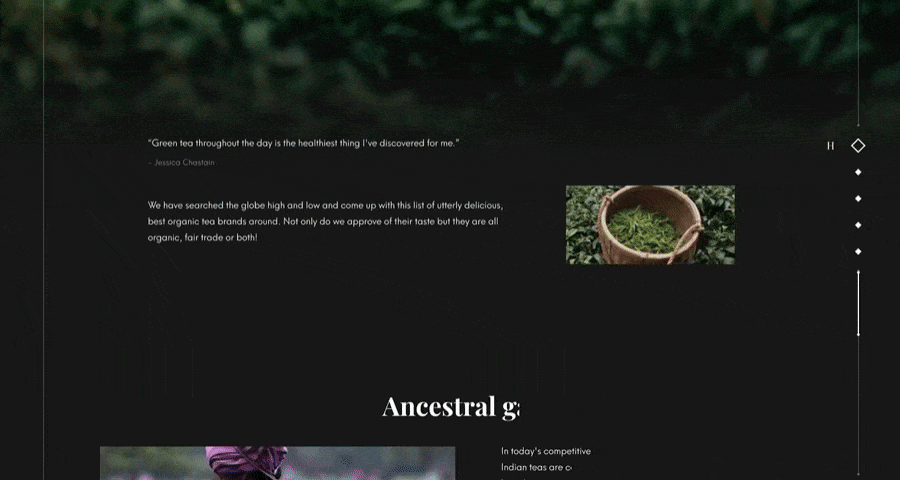
On the Tea Manufacturer Website, as users scroll down, tea product images and descriptive text fade and slide into view sequentially, creating a visual hierarchy that draws attention to each section. The motion is subtle and well-timed, making the content feel interactive and engaging while keeping the user oriented. This technique ensures that users can focus on one piece of information at a time, improving comprehension and engagement across the page.
Micro-interactions are subtle animations triggered by specific user actions, such as clicking a button, toggling a switch, or hovering over an element. They provide immediate feedback, helping users understand that their actions have been recognized by the system. Properly designed micro-interactions enhance engagement, reduce errors, and increase user confidence.

Source
When you click the "Reload" button, a micro-interaction is triggered: the button fades to white, and the conversion icon on its left plays a looping animation automatically. This design enriches the user's web experience and helps users perceive the specific reload process.
Sequential animation introduces multiple elements in a controlled order, ensuring users’ attention flows naturally through content. By staggering the appearance of elements, designers can emphasize hierarchy and prevent users from feeling overwhelmed.
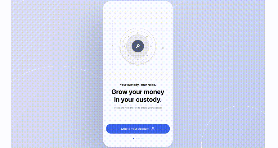
During the design process of this crypto trading app, when users click "Create Account" to enter (the page), the facial recognition and 2FA (Two-Factor Authentication) icons are displayed. Their display process is not synchronous; instead, they follow a sequential order—one step and part appears first, followed by subsequent parts—presenting a procedural state.
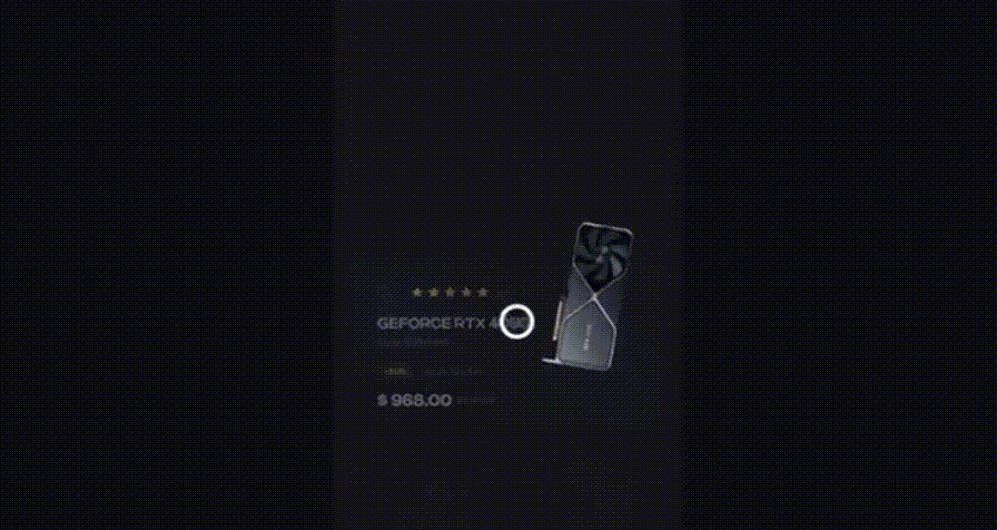
Easing refers to the gradual acceleration and deceleration of animations, mimicking real-world physics. Proper timing and easing make motion feel natural, improving user perception and making interactions feel less mechanical or abrupt.
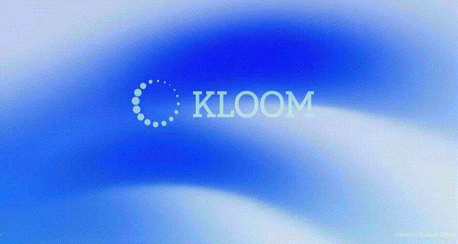
For example, in the display process of the KLOOM icon, the icon text appears at a relatively slow speed. After the entire logo text is fully displayed, the loading animation on the left suddenly accelerates and appears. This design demonstrates the website's fast loading speed, makes the interaction process more natural, and also enriches users' perception of the logo and product value.
Hover animations provide visual cues that highlight interactivity without overwhelming the interface. They invite users to explore and interact with elements, improving discoverability.
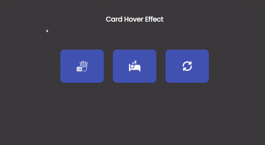
In this card hover effect, when the mouse hovers over each card with an icon, the content text corresponding to that icon appears. For instance, when hovering over the card with a hamburger icon, the card triggers an animation and displays the text "eat".
Contextual transitions help users understand changes in state or navigation by visually connecting related screens or elements. They prevent disorientation by showing how elements relate to each other over time.
Source
When opening a detailed product page, the thumbnail image expands smoothly into the larger product view, maintaining spatial continuity and ensuring users understand the transition from the overview to detail.
Parallax motion involves layered elements moving at different speeds, creating an illusion of depth and dimensionality. It enhances visual interest and guides user attention along a scrolling journey.
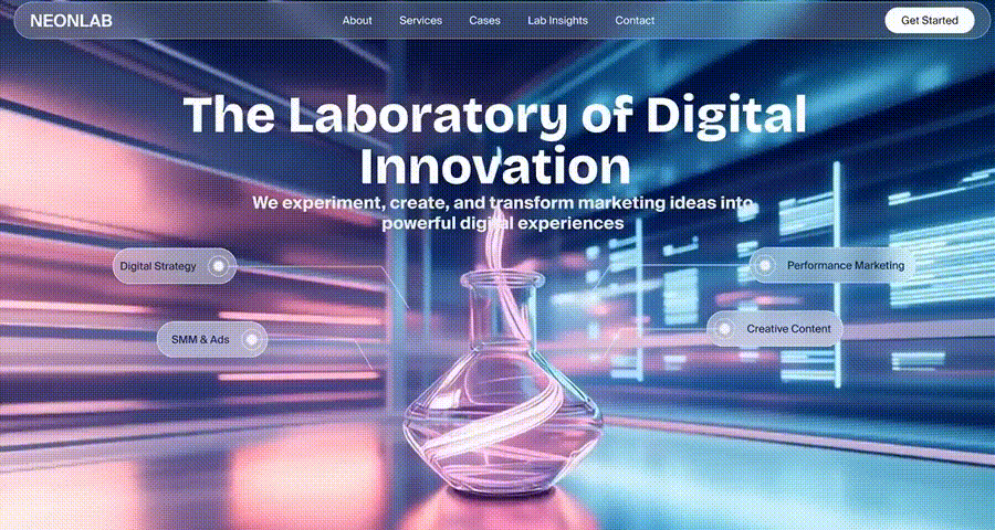
For example, the hero section on NEONLAB's homepage uses parallax effects on the electronic background, foreground laboratory beakers, and text layers. This not only gives the page an immersive and 3D stereoscopic effect, but also subtly guides users' attention to the core homepage text that conveys product value.
Delayed animations or feedback can draw attention to changes or updates that might otherwise be missed. Used judiciously, they can enhance comprehension and ensure critical elements are noticed.
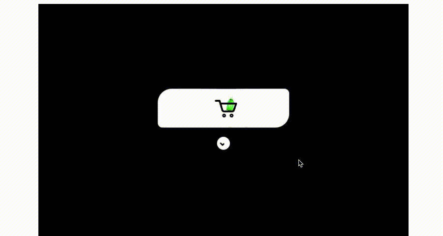
For example, when a user adds a product to their shopping cart, a short animation briefly highlights the cart icon. This design not only confirms that the "add-to-cart" action has been completed, but also does not interrupt the user's current browsing flow.
Looping animations are continuous, subtle motions used to draw attention or indicate ongoing activity. They should be non-intrusive to prevent distraction.
The illustration on the homepage gently moves in a loop, adding life to the page while keeping focus on the content. The animation is soft, creating engagement without overwhelming the user.
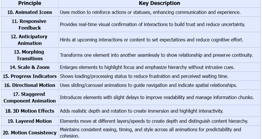
Animated icons provide visual reinforcement for actions or statuses, making information easier to understand quickly. Motion conveys meaning more efficiently than static visuals alone.
For example, when explaining product information on the homepage of this medical website, a dynamic hospital icon is used. The icon indicates the selected state through continuously changing animation effects and also enhances the interactive experience.
Responsive feedback uses motion to acknowledge user interactions in real time. Immediate visual confirmation improves trust and reduces uncertainty, helping users feel that the interface is responsive and reliable.
On this website, clicking the "Details" button triggers a wavy line animation on the button itself. This design not only confirms that the "view details" action has been received, but also does not interrupt the user's current browsing process.
Anticipatory animations give users hints about upcoming interactions or content, setting expectations and reducing cognitive effort. This helps users predict what will happen next, improving usability.
Before a new section slides into view, a subtle arrow animation suggests the direction to scroll, guiding users naturally through the page flow.
Morphing transitions transform one element into another, creating a seamless connection between interface states. This helps users understand relationships and preserves continuity.

Take the MoniPay App as an example: when users click "Transaction" at the bottom, it expands into a detailed view. The card's image and text smoothly transform into a larger card and cover the previous text content. This ensures users do not feel disoriented during the transition, helps optimize the user experience, and guarantees the smoothness of the entire interaction process.
Scaling or zooming animations draw attention to key elements or sections without using intrusive visual cues. They emphasize hierarchy and help users focus on important information.
When a user swipes upward (with a gesture), the corresponding animal display card slightly enlarges, and the next animal card is incorporated. This design emphasizes the hierarchical relationship between the cards while ensuring the contextual connection remains intact.
Progress animations communicate loading or processing status, reducing user frustration and perceived waiting time. They make the interface feel responsive even when data takes time to load.
This effect can be applied to shopping scenarios to display the entire process from the user placing an order to making a payment. During the design implementation, animated placeholders or skeleton screens will appear in the corresponding positions, reassuring users that the content is being loaded.
Directional animations guide users’ attention and indicate flow, helping them understand spatial relationships and navigation paths.
When showcasing all the fitness exercises available in the app, a sliding carousel design is used, where different exercises move from right to left. This design not only clearly highlights the differences between various exercises but also helps users understand the different exercise types by capturing their attention.
Staggered component animation introduces elements one after another with slight delays, guiding user attention and improving readability. This principle ensures that complex or content-heavy interfaces don’t overwhelm users, allowing them to process information in manageable chunks.
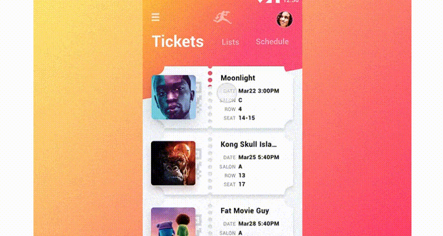
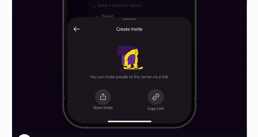
On a ticket list, each ticket fades or slides into view sequentially, rather than all appearing at once. Users can focus on one card at a time, making the interface feel more dynamic and digestible.
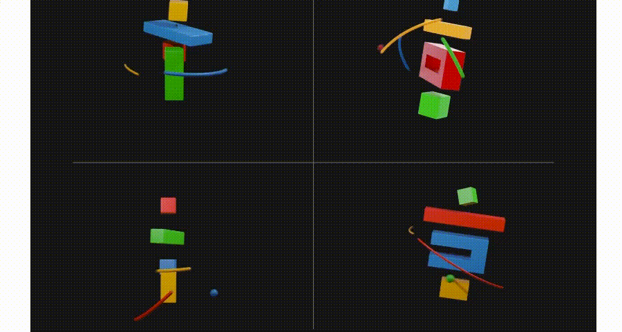
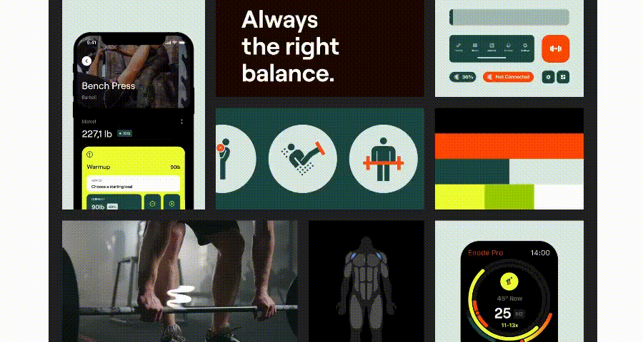
3D motion effects bring realistic depth and spatial relationships into interfaces, creating immersive experiences that engage users and communicate structure intuitively. These effects can enhance perception of hierarchy, emphasize interactive elements, and make digital products feel more tactile.
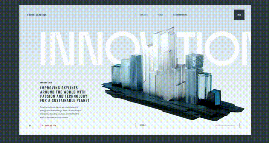
On the homepage of this website, the cube on the right rotates slightly along the Y-axis. It highlights interactivity and a sense of depth through a 3D perspective, helping users distinguish interactive elements from static ones while also adding a premium texture and engaging appeal to the interface.
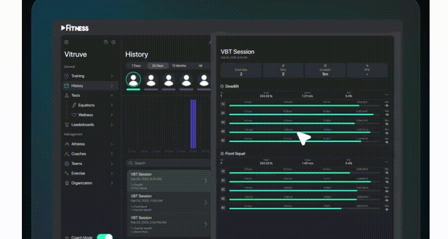
Layered motion involves multiple interface elements moving at different layers or speeds to create a sense of depth and hierarchy. Unlike parallax scrolling, which primarily affects background/foreground during scroll, layered motion can occur in any interface context—such as modals, card stacks, or dashboards—helping users distinguish levels of content and understand structure intuitively.

On a dashboard or product overview page, cards and charts animate independently, with foreground metrics moving slightly faster than background panels. This layered animation draws attention to key information while maintaining context for secondary elements.
Consistent motion across the interface ensures users predict behavior and feel confident interacting with elements. Consistency in speed, easing, and animation style reinforces usability and brand coherence.

All hover effects, page transitions, and modal animations on the website follow the same easing curve and timing, creating a cohesive and professional experience.
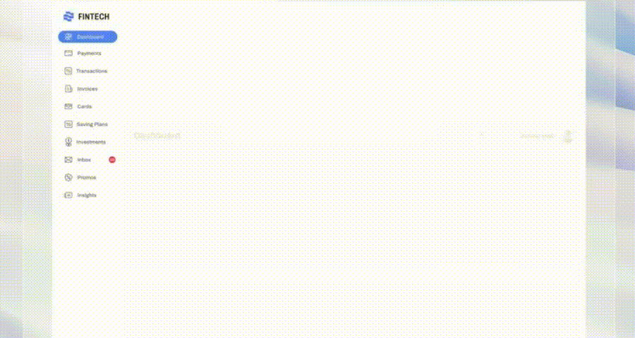
Creating motion design in UI/UX is not just about making interfaces visually engaging—it’s about ensuring that every animation enhances usability, guides attention, and improves user experience. Using a structured prototyping and testing workflow, designers can refine their motion designs before development. Here’s a step-by-step approach using Mockplus RP:
Start by constructing a high-fidelity prototype of your interface. Mockplus RP enables designers to lay out screens, components, and placeholders, creating a digital canvas that mirrors the final UI. This step focuses on structure, layout, and visual hierarchy, ensuring all elements are in place before adding motion. For example, you can map out a dashboard, product list, or card layout to prepare for interaction and animation design.
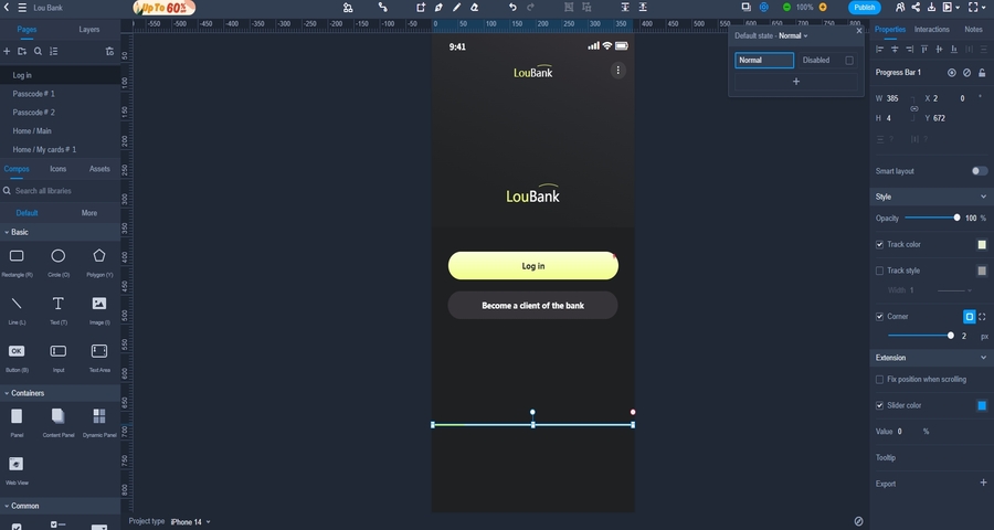
For example, if I need to add a pre-login loading animation to this page, I will first incorporate a progress bar into my prototype. Then, I will add a rectangle, set the dimensions and colors for both elements respectively, and proceed to the next design step.
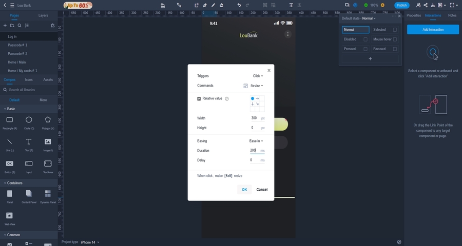
Once your prototype is set, it’s time to bring it to life with motion. Mockplus RP allows designers to:
This step lets you experiment with timing, easing, and animation sequences, making sure each movement serves a purpose and guides the user's attention naturally.
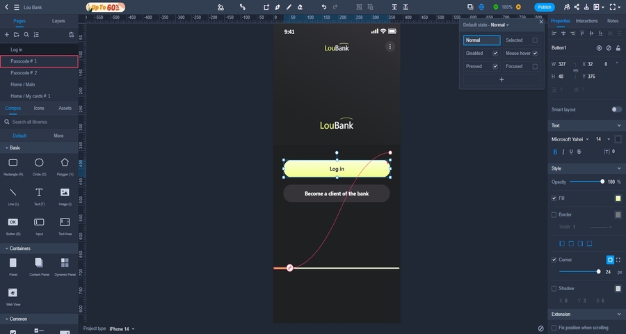
In this step, I add the "Log In" button interaction to the rectangular loading box, set its animation easing to "ease in," and define the animation’s changing factor as the width of the rectangle. With this, a simple motion is completed.
After adding motion, use Mockplus RP’s interactive preview to experience the design on desktop or mobile. Evaluate whether animations:
Once satisfied, the prototype can be downloaded or exported, providing a ready-to-use reference for presentations, demonstrations, or handoff to developers. This allows designers to validate and share motion designs efficiently, ensuring clarity and precision before implementation.
Motion design continues to evolve rapidly, transforming the way users interact with digital interfaces. In 2025, designers are exploring more intuitive, engaging, and meaningful motion experiences. Here are the five key trends:
Micro-interactions are no longer just decorative—they are designed to communicate system status, guide user behavior, and provide instant feedback. In 2025, designers focus on context-aware micro-interactions that adapt based on user actions, device type, or user history, making interfaces feel intelligent and responsive.
Alt: micro-interactions motion design
Purposeful micro-interactions reduce cognitive load, enhance usability, and improve engagement by making every user action feel acknowledged and meaningful.
3D motion and layered animation create depth, dimensionality, and a tactile sense in digital interfaces. Designers are increasingly using 3D transformations, card rotations, and layered animations to highlight hierarchy, guide focus, and create immersive experiences.
Alt: 3D motion design
3D and layered motion enhance visual storytelling, improve interaction clarity, and make interfaces feel premium and interactive.
With AI integration, motion design can anticipate user behavior, providing smoother, contextually aware transitions and recommendations. Predictive motion helps users navigate faster, focus on relevant content, and feel that the interface “understands” their needs.
Alt: predictive motion design
Predictive animations improve efficiency and user satisfaction, particularly in content-heavy platforms or personalized dashboards, by guiding interactions intelligently.
Motion is increasingly used to convey narrative and context, rather than serving merely as decoration. Sequential content reveals, scroll-triggered animations, and animated illustrations all play a key role in guiding users through storytelling or a complete process—making interfaces more engaging and memorable.
Alt: storytelling motion design
Story-driven motion enhances engagement, guides focus, and improves content retention, especially for onboarding flows, tutorials, or marketing landing pages.
Data-heavy interfaces are becoming more interactive and informative through animated charts, graphs, and dashboards. Motion helps users understand trends, compare metrics, and notice changes quickly, turning static data into actionable insights.
Alt:animated visualizations motion design
Animated visualizations reduce cognitive load, make complex information digestible, and enhance decision-making, particularly in analytics, reporting, and performance dashboards.
A motion designer in UI/UX focuses on creating purposeful animations that enhance usability, guide attention, and improve user engagement. Their work goes beyond making interfaces look appealing—they design micro-interactions, transitions, loading animations, and visual feedback that make digital products intuitive and enjoyable. In practice, a motion designer collaborates closely with UX/UI designers, product managers, and developers to ensure animations align with interaction goals and user expectations.
Traditional animation is often story-driven and linear, primarily focused on entertainment or visual narrative. Motion design in UI/UX, however, is functional and interactive, serving specific purposes such as:
Yes. Overusing motion can lead to cognitive overload, distraction, or even motion sickness in some users. Too many simultaneous animations, flashy effects, or overly long transitions can reduce clarity and frustrate users. Best practices include:
Moderation ensures that motion supports the interface rather than overwhelming it.
Absolutely. Thoughtful motion design can guide users toward desired actions, provide feedback, and reduce perceived waiting time, all of which can improve engagement and conversion. Examples include:
By making interactions smoother and more predictable, motion design reduces friction, builds trust, and encourages users to stay longer.
Some pitfalls to avoid include:
Beginners should focus on purposeful, subtle, and consistent motion, testing interactions with real users to ensure the animations enhance usability and perception.
Motion design is no longer just a decorative element in UI/UX—it is a strategic tool that shapes how users perceive, navigate, and interact with digital products. From subtle micro-interactions to immersive 3D animations, motion can guide attention, reduce cognitive load, and create interfaces that feel alive, intuitive, and engaging.
In this guide, we explored 15 essential motion design principles with real-world examples, discussed how to prototype and test animations effectively, and highlighted the top motion design trends for 2025. By understanding these principles and applying them thoughtfully, designers can craft experiences that delight users, improve usability, and even drive better engagement and conversions.
Remember, the key to successful motion design lies in purposeful, consistent, and user-centered animation. Test your ideas, iterate on prototypes, and focus on motions that support clarity and interaction, rather than overwhelming the interface. With careful application, motion design transforms interfaces from static screens into dynamic, responsive, and memorable experienc
 Mockplus RP
A free prototyping tool to create wireframes or interactive prototypes in minutes.
 Mockplus DT
A free UI design tool to design, animate, collaborate and handoff right in the browser.


 Sign up with Google
 Join our Discord community
 support@mockplusapp.com